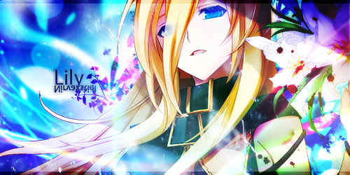
Hmmm, I actually did great with these 2 sigs ^_^
I see how GIMP can be better than Photoshop
I like how the image came out bright and luminant :)


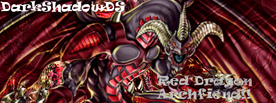
wh-what did you say Charlie!!??Tezuka Kunimitsu wrote:Tue May 04, 2010 2:18 pmi think ur red one is covering the background and the effects on the pic, try to re-size it smaller and add the effects, if you want, add a little layer effect on the dragon.
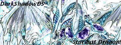
the stardust dragon looks ossim, but to me, it looks like failed ripping. i can see alot oh holes in the lines